Year
2025
Category
Portfolio
Product Duration
3 - 4 Weeks
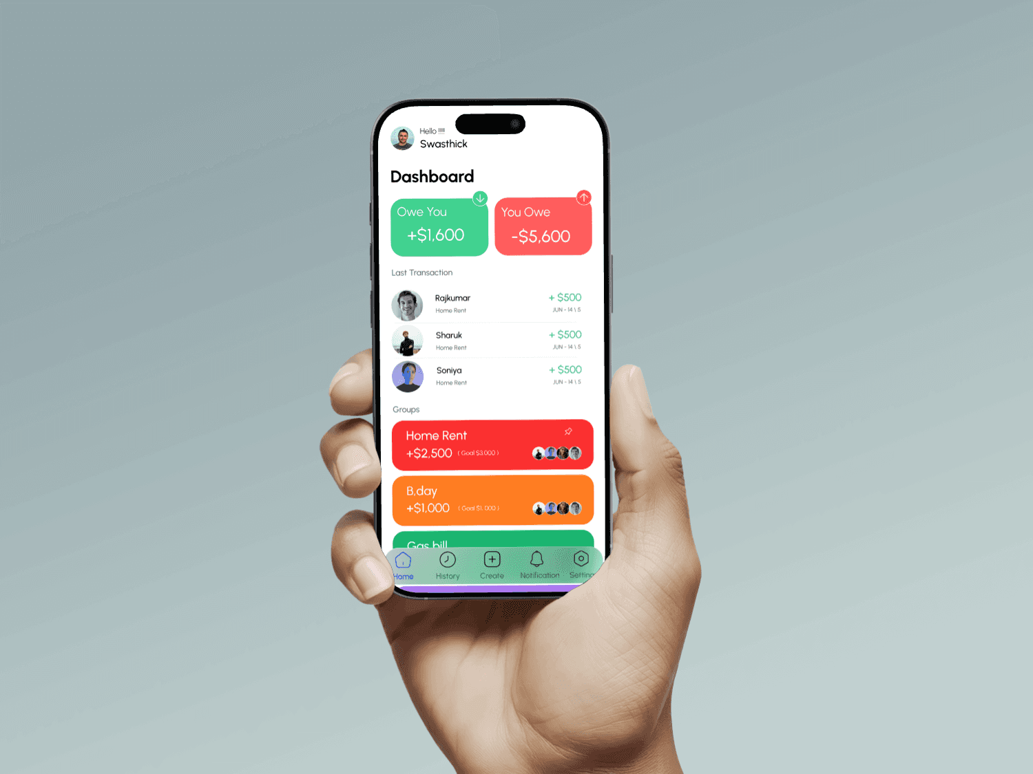
To better understand user needs, I conducted a short survey among students and roommates. Most users relied on WhatsApp or spreadsheets to manage shared expenses, which often led to confusion and forgotten dues. They preferred a solution that was quick, easy to use, and visually clear. I also reviewed existing apps like Splitwise and found them cluttered for casual users. This guided my decision to design a clean, minimal interface focused on clarity, real-time tracking, and simple bill splitting.
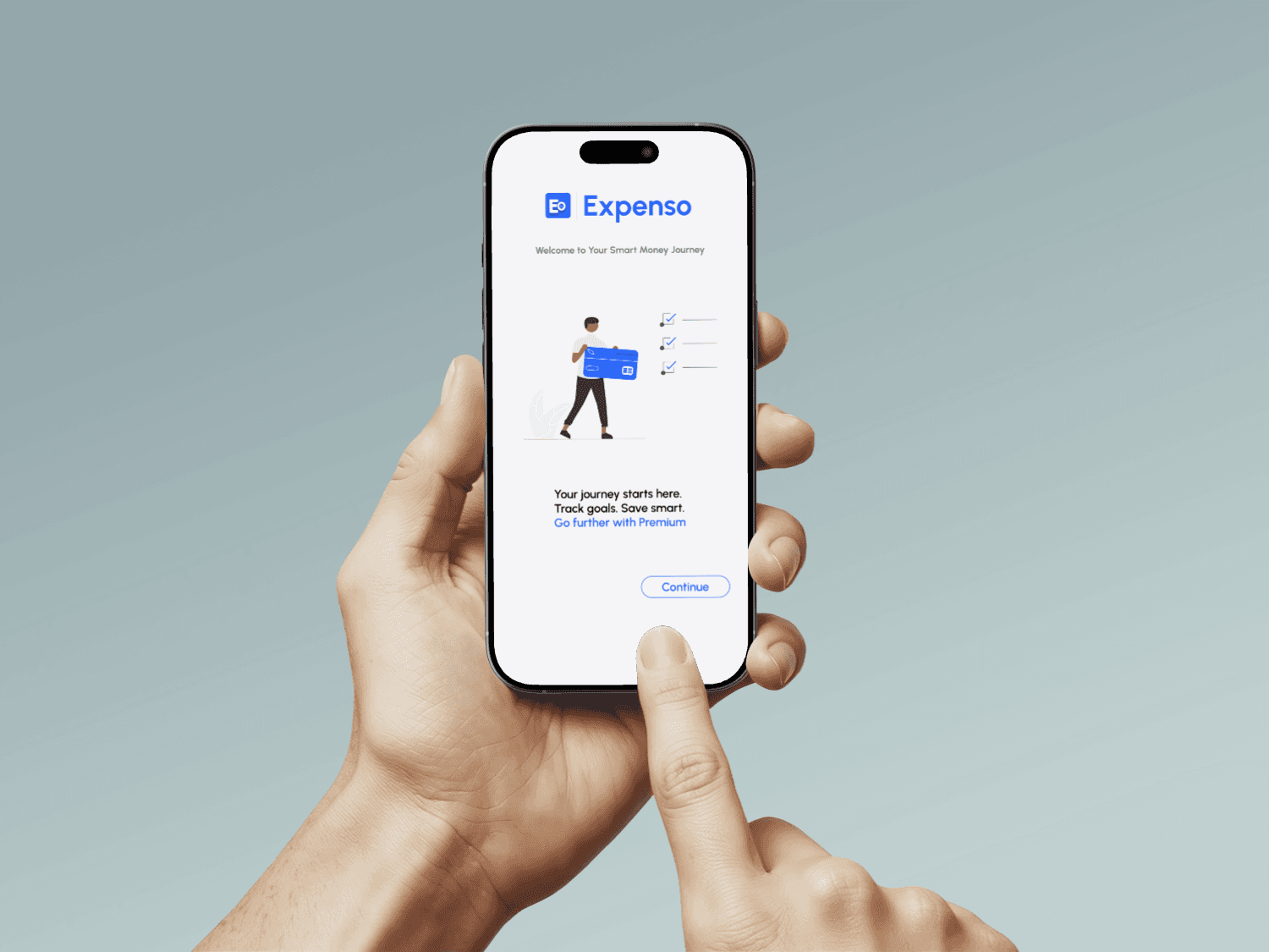
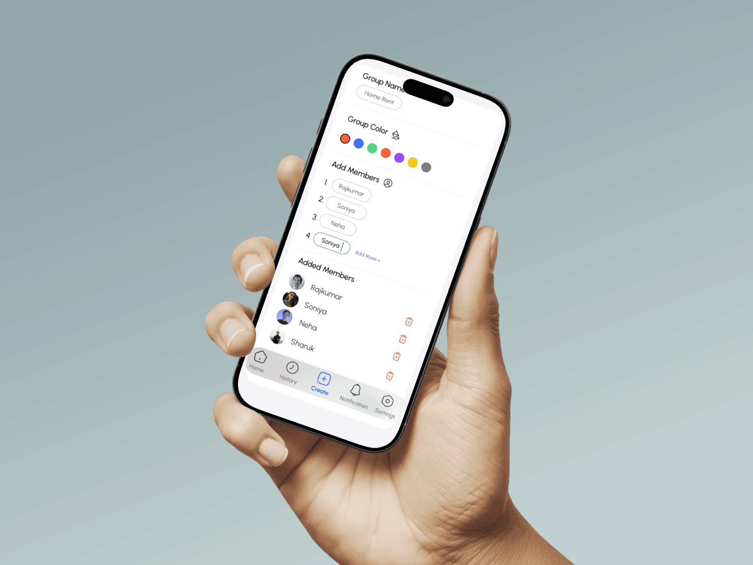
The design focuses on clarity, minimalism, and ease of use. I created wireframes and high-fidelity mockups using Figma, ensuring the layout was intuitive for first-time users. The dashboard displays group balances with color-coded indicators, while the add-expense flow was kept fast and frictionless. Rounded cards, soft shadows, and a modern color palette were used to make the app feel friendly and reliable.
After creating a clickable prototype in Figma, I conducted quick usability testing with 4 users (students and roommates). Feedback highlighted that the dashboard was easy to understand and the add-expense flow felt smooth. Minor adjustments were made to icon placements and button spacing based on their input. Users appreciated the clean layout and said they would prefer it over manual tracking tools.